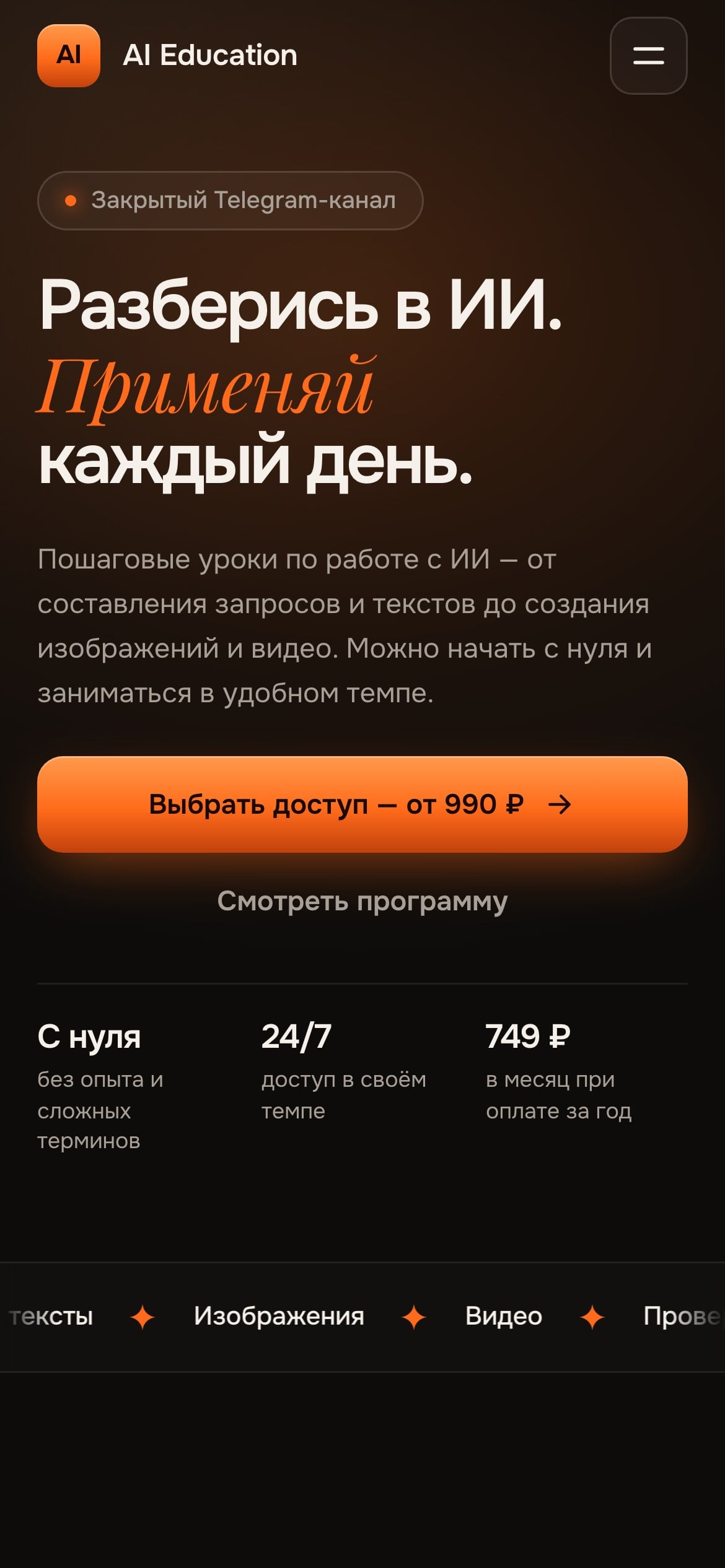
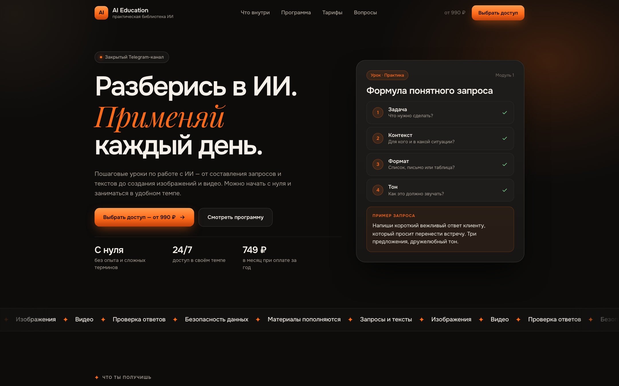
A lesson on the first screen
Next to the headline sits a lesson card: a four-part formula for a prompt and an example that types itself out. The product is clear before the first scroll.

A sales page for a private library of AI lessons.
AI Education sells access to a private Telegram channel with lessons on working with AI. The project needed a page that shows the product to a beginner and leads to a request without a complicated funnel.
The project had a site built on an AI template. The content was there, but the page looked like many others and didn't show how the lessons work. A beginner needs to see that before buying.
We kept the content and rebuilt the page: design in Figma first, then the site. Visitors now see the format itself: a lesson card, a step-by-step program and a live example of a prompt. Choosing a plan opens Telegram with a message already written, so a request is one tap away.
Next to the headline sits a lesson card: a four-part formula for a prompt and an example that types itself out. The product is clear before the first scroll.
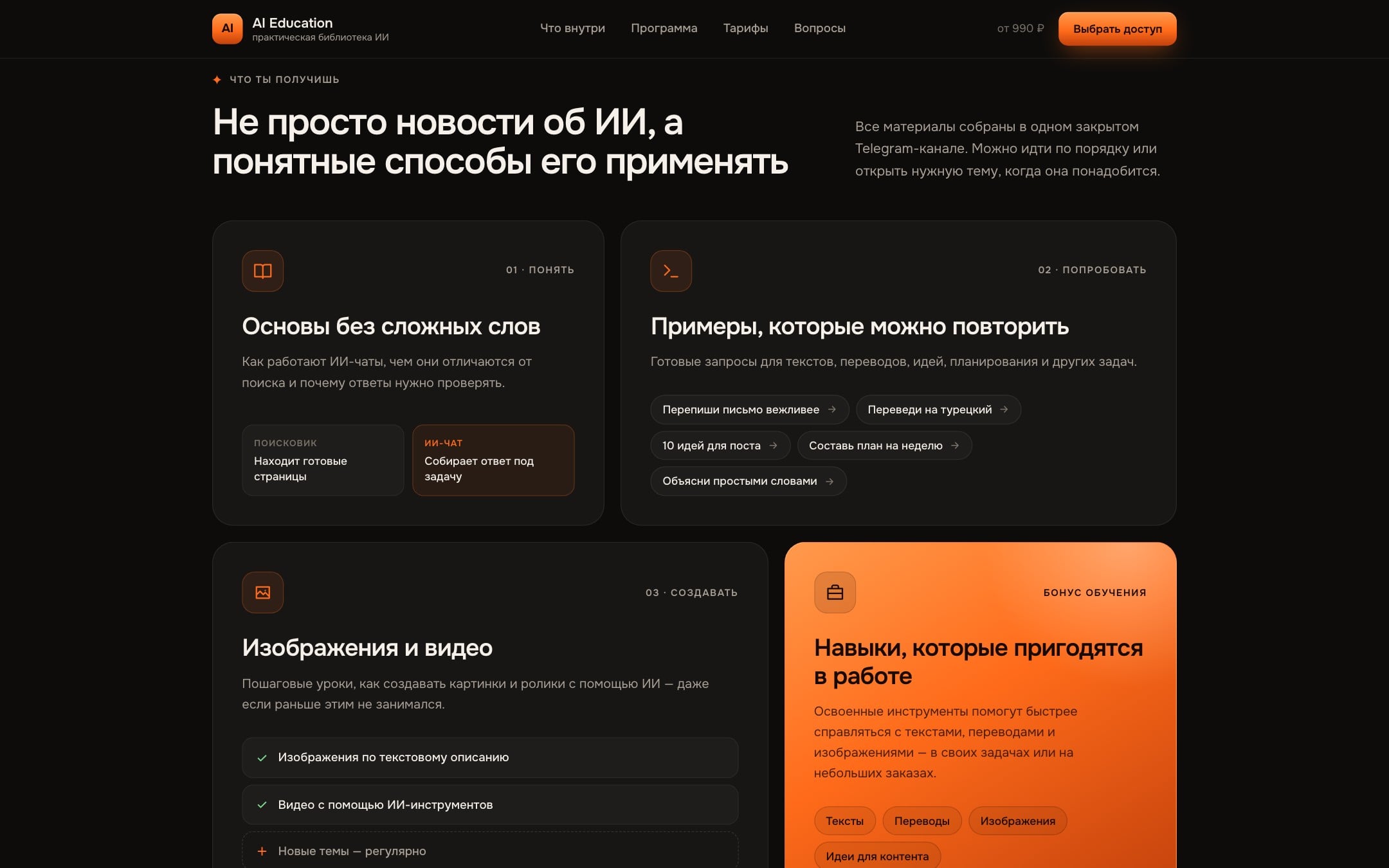
Topics are split into blocks of different sizes: the basics, ready examples, images and video. Small comparisons and sample prompts inside show what the lessons actually cover.
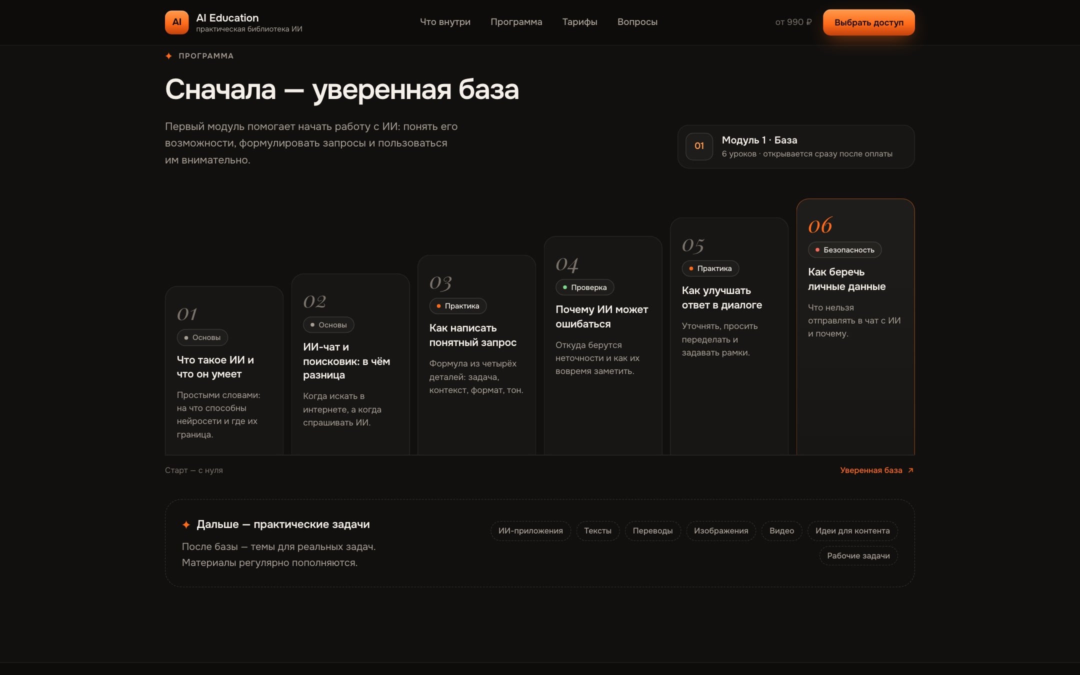
The six lessons of the first module climb in steps from the basics to data safety. You see both the scope and the path from zero to a solid foundation.
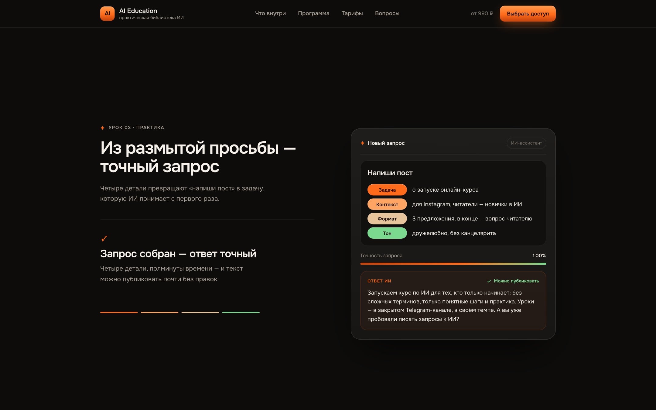
One lesson became a pinned scene. Details drop into the prompt one by one, accuracy climbs, and the AI's reply turns from vague phrases into text ready to publish.
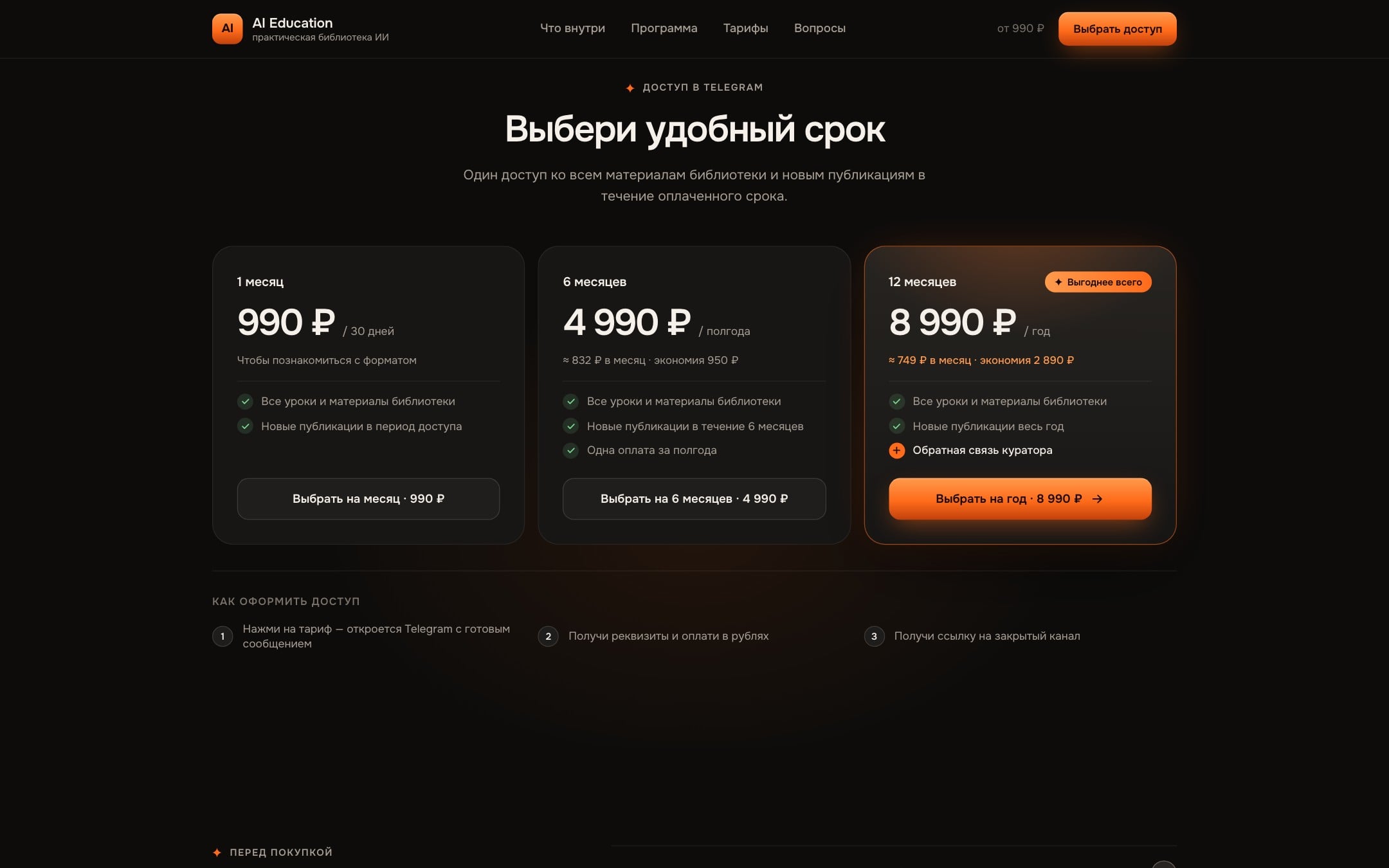
Each plan opens Telegram with a ready message that already names the term and the price. The visitor just sends it, and the project owner sees the choice right away.
We built the colours, type and components in Figma, then the layouts for desktop and phone. That's why the site feels whole on both screens.
There was more animation at first, and we cut it back. The main thing left is the GSAP scene that builds a prompt: it shows what the product teaches.
The request text lives right in the Telegram link. With no database or forms, the page has fewer parts to maintain.
Clean Onest for headlines and Playfair Display italics on accent words. With warm graphite and orange, this moves the page away from the look of a stock template.

Tell us about your idea. We reply within one business day.
Discuss your project